

By Elena Vasquez – Sustainable Design Innovator
Why Color Choice Matters
Color steers how breeze blocks read in a space—from quiet background texture to bold architectural statement. With ModaConcrete’s handcrafted surfaces, finishes interact with light to accentuate perforations, deepen shadows, and set the mood. Start with use–case: calm privacy screen, nature–forward garden wall, or a gallery-clean indoor partition—then choose a palette that supports the experience.
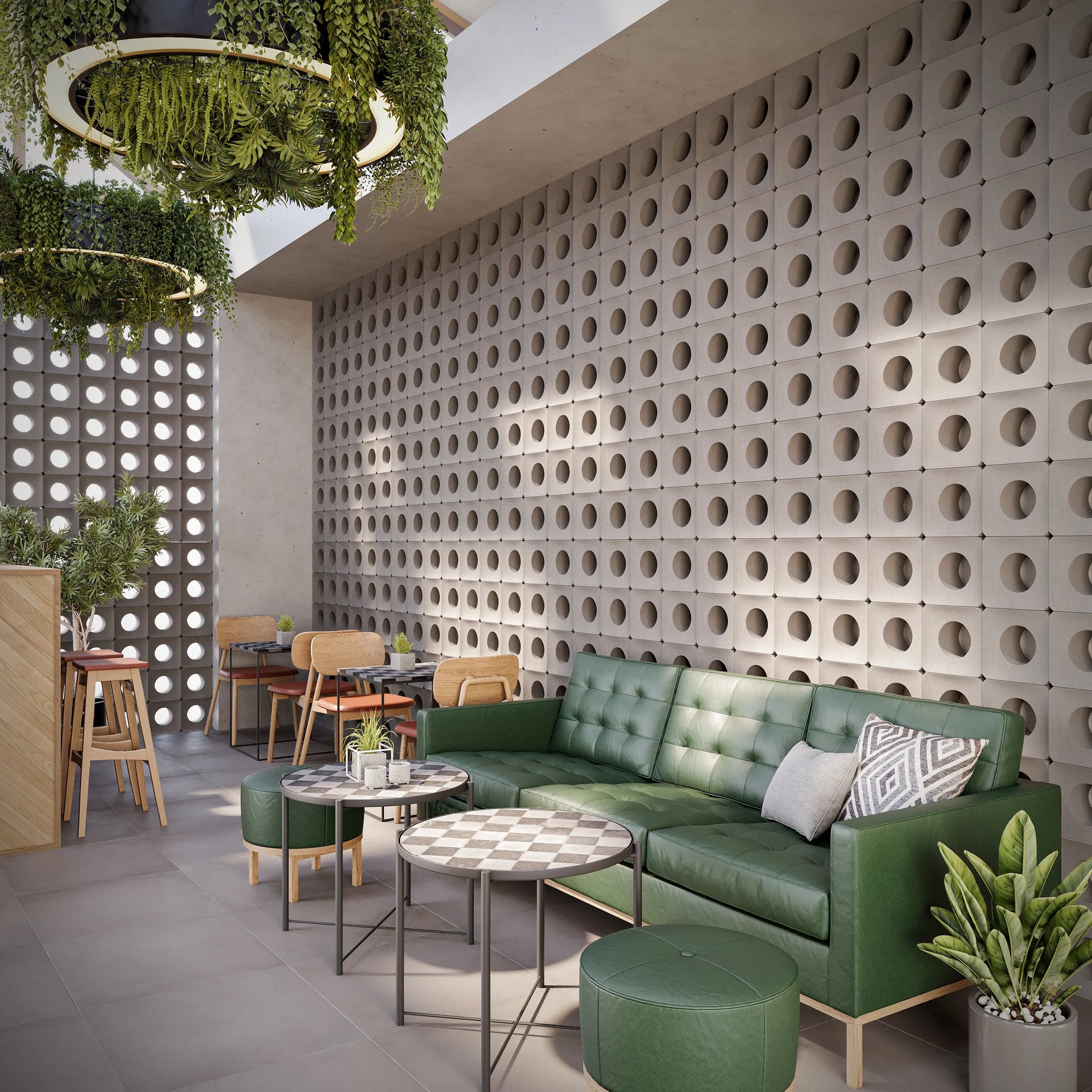
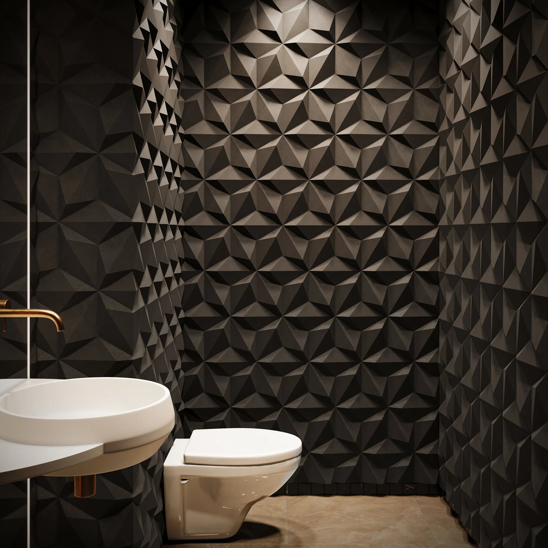
Monochrome: Timeless, Minimal, Shadow-Forward
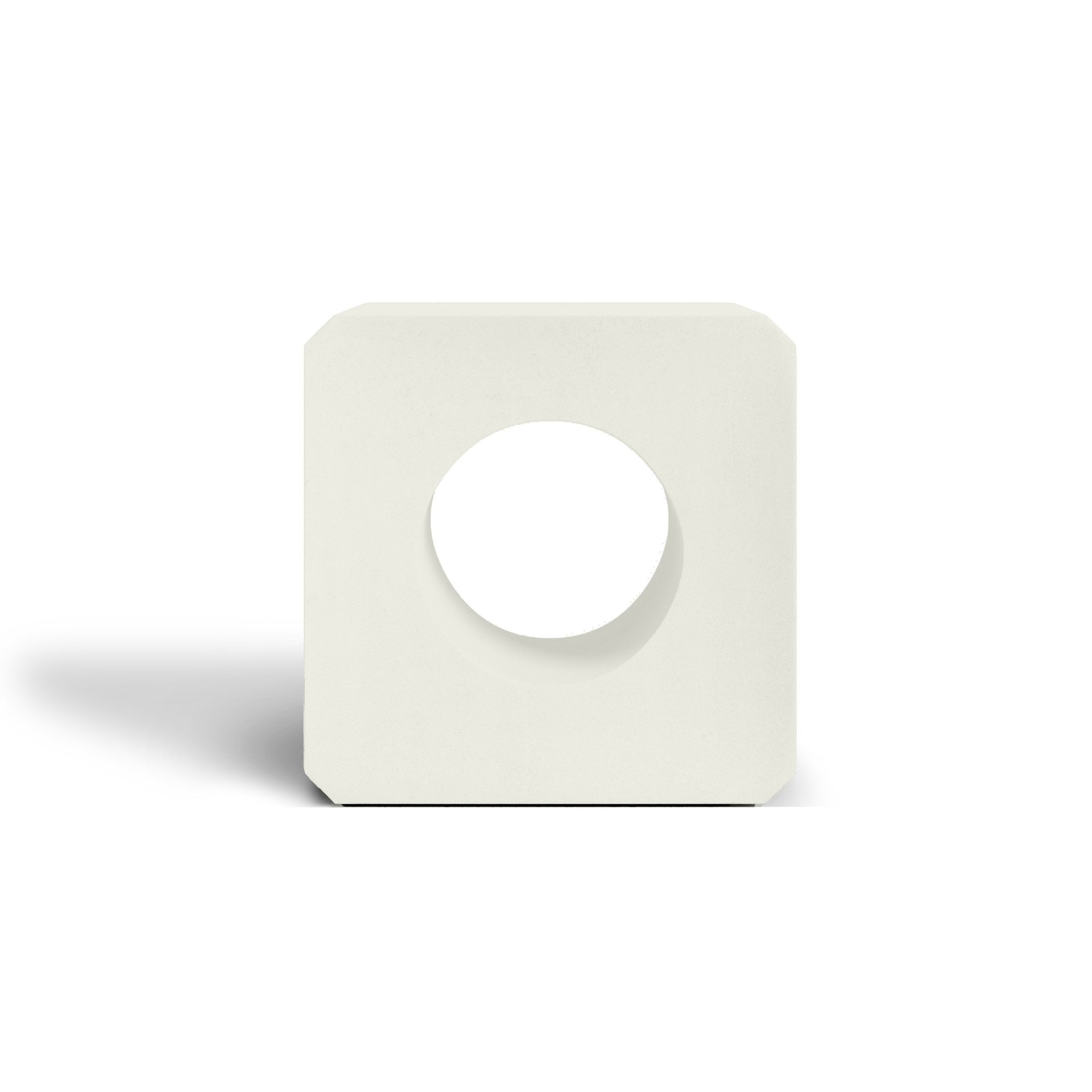
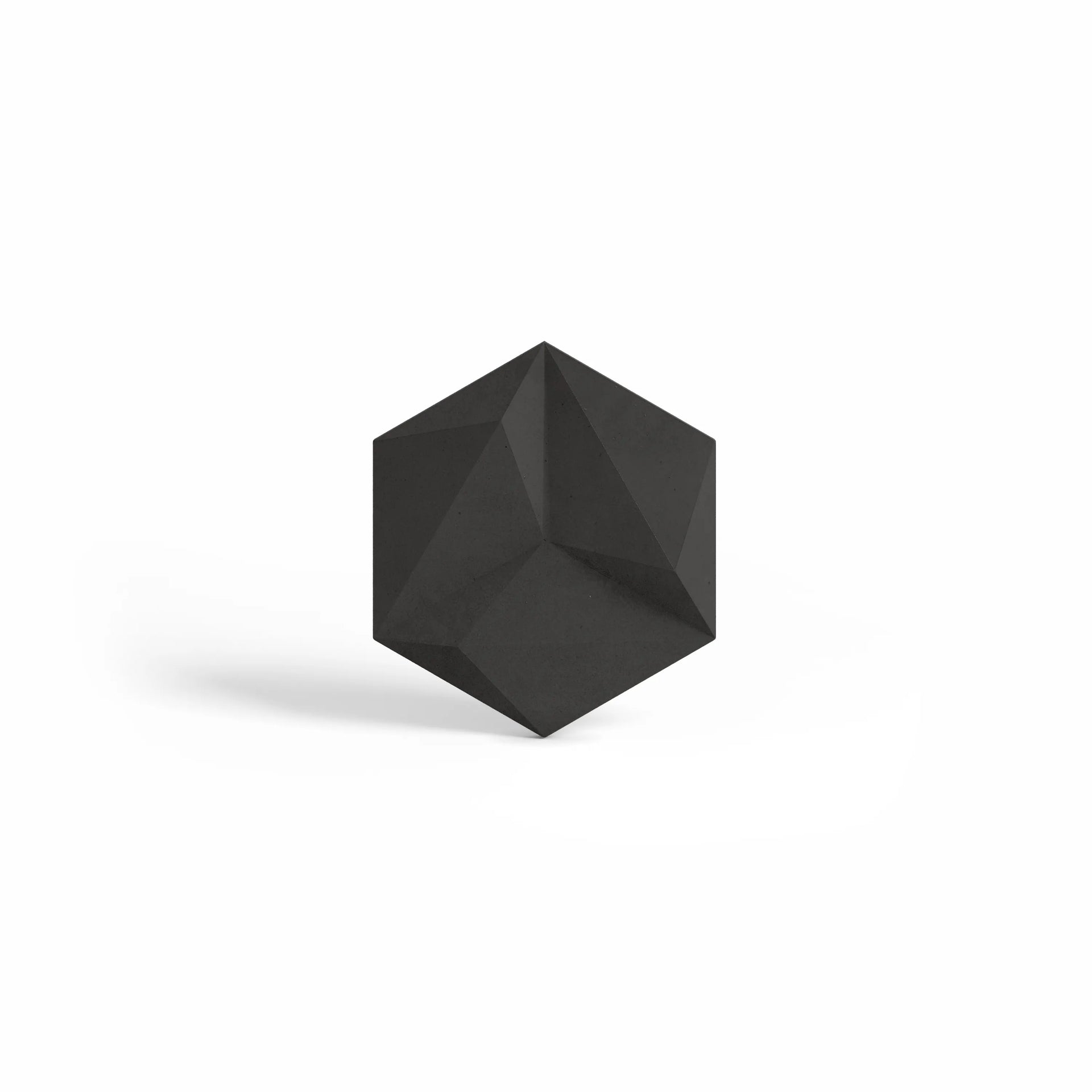
Monochrome schemes (e.g., layered neutrals) keep attention on geometry and light play. They’re ideal for indoor partitions, entries, or façades where pattern should lead. Use KUBE for crisp grids; frame focal sections with ALVA to add soft curvature without breaking the calm. Complement with a concrete table and refined planting in planters.
Earth-Tones: Grounded, Biophilic, Outdoor-Ready
Earth-tones (sand, stone, clay, sage) tie architecture to landscape for a warm, organic feel. They shine on garden walls, pool screens, and indoor–outdoor transitions. Pair ALVA’s curves with natural hues to soften massing; anchor with fountains for sound and movement. Textured finishes deepen variation and patina gracefully.
Bold Colors: Statement Walls with Purpose
Bold accents turn breeze blocks into brand or design moments—patio backdrops, retail entries, or media walls. Use color strategically in framed fields: keep the surrounding grid neutral (KUBE), then infill a central panel in a saturated hue. After dark, wash with low lighting near fire features to amplify pattern and color.
How to Select & Specify Your Finish
- Sample first: Order the Concrete Color Sample Pack; evaluate daylight vs. evening lighting where the wall will live.
- Match to shape: Smooth finishes emphasize KUBE’s precision; subtly textured finishes enrich ALVA’s curves.
- Zone by function: Neutral near seating; richer tones for focal planes; earth-tones where planting dominates.
- Seal for longevity: Seal after cure to protect tone and simplify cleaning; reseal per exposure and use.
Pulling the Palette Through Your Space
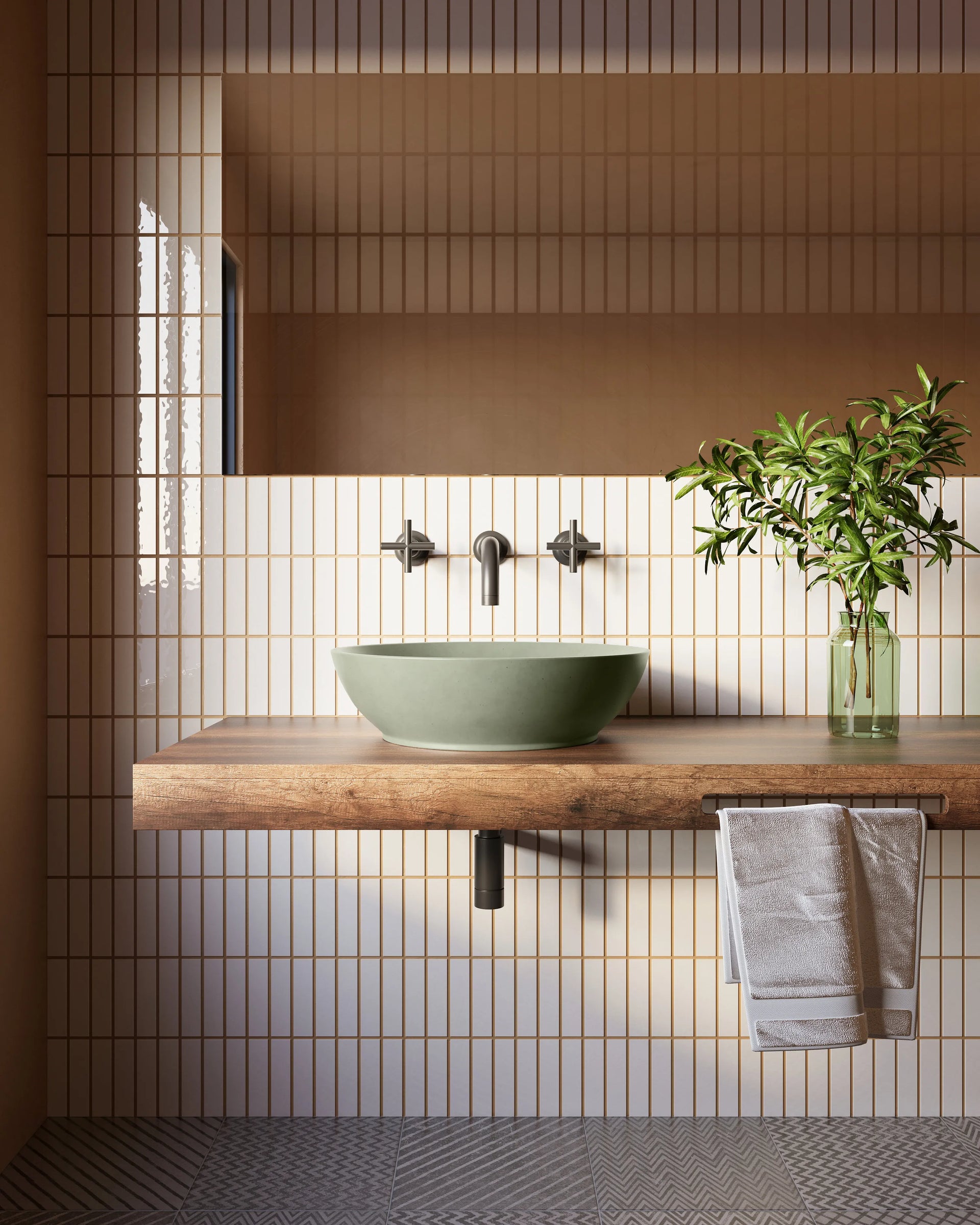
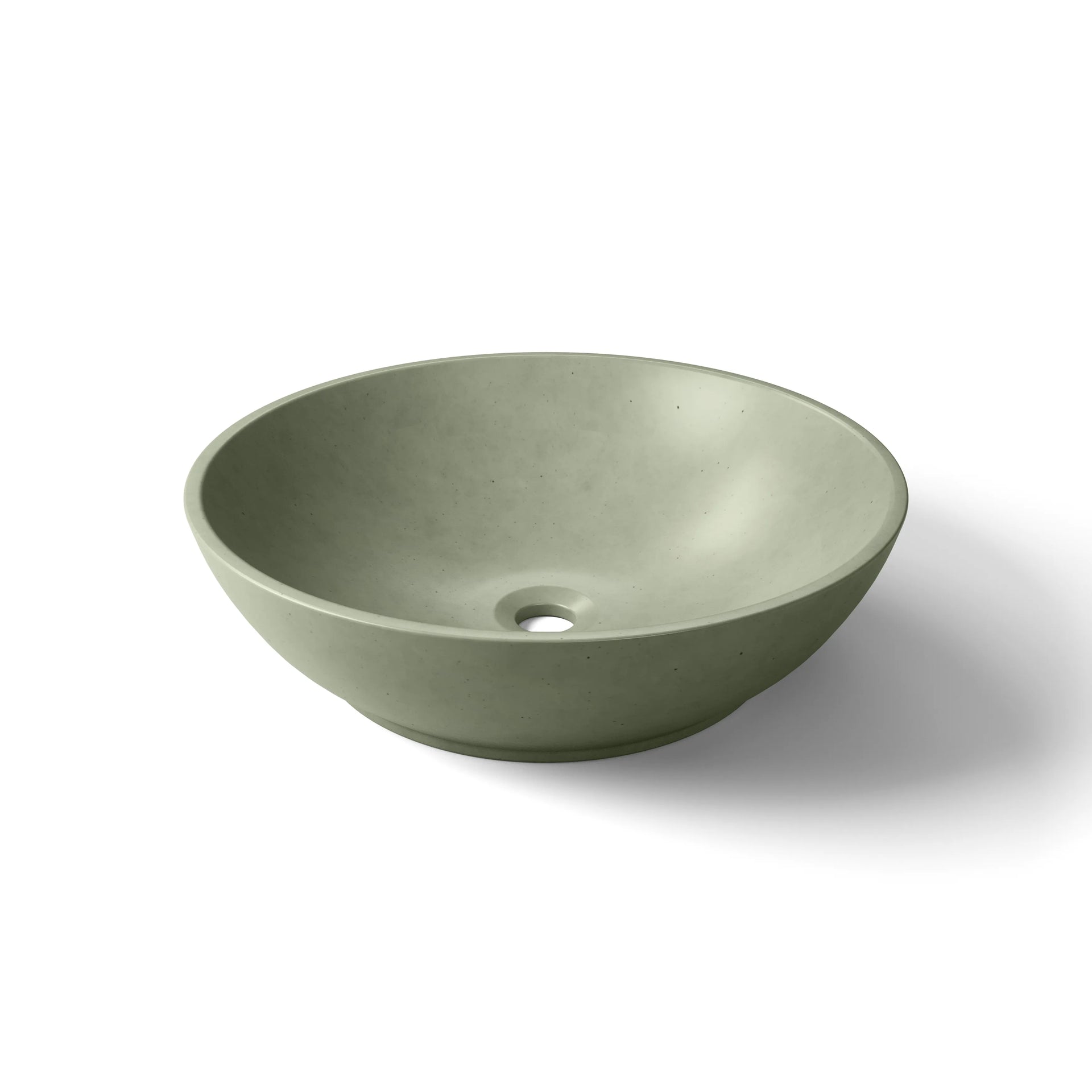
Echo the block color on adjacent concrete surfaces to create cohesion: a matching table top, a complementary sink, or coordinated planters. For indoor–outdoor continuity, repeat the scheme across thresholds so the grid, hue, and texture read as one story.
Frequently Asked Questions
How do I choose between monochrome, earth-tone, and bold?
Start with intent: calm minimalism (monochrome), natural integration (earth-tone), or a focal statement (bold). Consider light, adjacent materials, and how the area is used.
Do KUBE and ALVA take finishes differently?
Both accept ModaConcrete finishes well. Smooth coats spotlight KUBE’s crisp edges; textured or nuanced hues accent ALVA’s sculptural cutouts.
Can I mix schemes in one project?
Yes—keep a dominant base (often neutral) and introduce earth or bold fields as framed accents. Use a consistent joint profile to unify the composition.
How do I preview colors accurately?
Use the Concrete Color Sample Pack in the actual location and view samples morning, midday, and evening before ordering.
Why Choose ModaConcrete
- Handcrafted precision: Small-batch casting for consistent geometry and refined joints.
- Sustainable durability: Efficient precast methods and natural aggregates built for long service life.
- Complete ecosystem: Coordinate blocks with planters, fountains, fire features, and furniture.
Conclusion
The right palette turns breeze blocks into architecture that speaks—quietly refined, warmly grounded, or confidently bold. Explore Breeze Blocks & Wall Tiles, order the Concrete Color Sample Pack, and connect via Contact Us to finalize specs. Review coverage on the ModaConcrete Warranty for peace of mind.